Tag Archives: curator

Upfield Urban Art Critics Collective

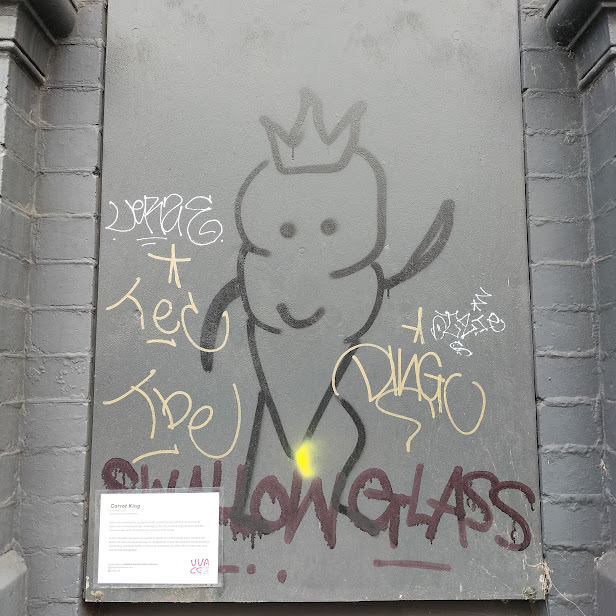
A laminated card is attached to the wood panel. Like those of all of the didactic cards that explain the art in art museums, the method of attaching is discreet; one suspects some kind of adhesive. The wood panel to which it is attached has various tags in various colours from marker pens and mops dripping ink. There is a drawing of a carrot character with a crown. The panel is blocking a window on a brick building in a Brunswick laneway. Both the bricks and panel have been painted grey, which is currently a fashionable colour.

Imagine the world’s largest museum, where everything is in the collection and on exhibition. That place exists; it is called the world. Now, imagine that this museum has curators like the UUACC. The Upfield Urban Art Critics Collective provides mock curatorial panels with information and comments about pieces of street art scattered across Brunswick and Coburg. For example:

“Carrot King

Artist name, 2023

Spray-paint on weatherboard

“Within the confines of the dystopian realm posited by this piece, a content carrot becomes a surreal sovereign, challenging the very essence of governance and the transient nature of constitutional monarchy in Australia.”

“As the monochrome Apiaceae asserts its dominion with a jaunty wave, viewers are beckoned into a cerebral odyssey, to navigate the similarities and differences between Carrot King and King Charles III. The only conclusion the artist offers is they may very well be interchangeable.”

I checked the UUACC’s website again about Carrot King, and it states: “Sadly, this piece is no longer in our collection.”

The UUACC’s text is humorous and political, cheerfully aware of art speak and art theory. It is not an original action, but then again, nothing is these days. Melbourne street art’s mad scientist CDH “street art reviews” did it in 2013. In his notes on his project, CDH refers to another guerrilla curatorial group, New York’s ongoing The Street Museum of Art.

These guerrilla curatorial panels treat the street as a gallery. The point is to make a curatorial comment on street art and graffiti, not removed from the street in a blog (like this), but immediately and adjacent to the original Carrot King drawing. Curatorial support, with all the implied authority, for graffiti and street art stands against the authority of the lawscape of property. The authoritative language of the panels creates an ironic contrast to the anarchic direct actions of the city’s surfaces that the panel refers to. Guerrilla artists and curators suggest guerrilla cataloguers recording everything in a laneway, and guerrilla archivists storing it in a warehouse as large as the world.

The author is not now, nor has he ever been, a member of the Upfield Urban Art Critics Collective. Nor am I a fan of curatorial panels in art galleries; the minimum data is the artist’s name, title, date of creation, media, and provenance. This final item, provenance, is lacking in both UUACC’s text and, more significantly, that of most major Australian art galleries. Knowing the history of a work’s ownership helps prevent art theft and forgery (having previously been owned by Subhash Kapoor or Douglas Latchford now rings alarm bells). Ownership of street art and graffiti is a more complex question but one that the ethically responsible curators at the UUACC need to address.

Ringholt’s Kraft

Someone has parked a red Datsun Charade with personalised number plates, CUR8OR, in the plaza in front of MUMA (Monash University Museum of Art) on Monash’s Caulfield campus. Even worse they have left the passenger window down and on the back seat there are some old clothing and rubbish.

Stuart Ringholt, CUR8OR

Is Stuart Ringholt embarrassed by this?

Kraft at MUMA is a mid-career exhibition of the art of Stuart Ringholt and Ringholt art is about embarrassment and conforming to social conventions. It feature two new commissions: Club Purple and the giant clock (oh er! that sounds a bit rude), Untitled, telling the wrong time.

Ringholt’s art posses particular problems for curators because his art is often ephemeral. Often his art is a personal experience for both Ringholt and responder/viewer, it questions the distance between the artists and the responder/viewer. Fortunately for the curators, Ringholt does produce some tangible art and some video work. They do have to double up with one Ringholt’s work currently on exhibition in Melbourne Now but have a longer version of his collage, Nudes, 2013. In this uptight contemporary world Ringholt is one of the few Melbourne artists who is focused on that perennial theme of the nude, as well as, in Ringholt’s case naturism.

Art curators are on Ringholt’s mind too as the car’s number plates and the five amazing episodes of the video Starring William Shatner as the Curator, 2010. Is Ringholt trying to embarrass the curators, as well as, himself? Shatner and the cut-up Star Trek episodes make wonderful jokes about curators.

But seriously, aesthetics is a far wider topic than just the beautiful. Aesthetics can be a way of experiencing things. In the late 20th century consideration began to be given to a range of aesthetic experiences; kitsch was examined by Clement Greenberg, camp by Susan Sontage and other writers and artists have explored aesthetic experiences ranging from sentimentality to cornball, from horror to funk. Ringholt’s art poses the question is there an aesthetic of embarrassment? If there is then part of it would cross over into the aesthetics of the comic and the cute and, it would be equally possible to cross over into the multiple aesthetics of contemporary art.

Which bring me back to an important point about Ringholt’s art it is often very funny. Even if embarrassment humour is not my taste I did get a laugh (LOL) from Ringholt’s Conceptual Art Improving My Embarrassing Life, 2003, a series of collage books and magazines to leaf through. The cover was often so completely different to the contents.

Stuart Ringholt, low sculptures

The room of low sculptures with the modified chairs, drink/spray cans and joke fake sausages are some of the funniest sculptures that I’ve seen in awhile. Things in Ringholt’s world are thoughtful combined to be as awkward as possible and inelegant solutions are carefully engineered.

I didn’t use Club Purple, Ringholt’s nude disco even though I was there on a Thursday that was set aside for solo dancing. Was I too embarrassed or simply too time poor? The form for bookings at Club Purple was intimidating enough.


O No

I think about the parts of art that other critics don’t look at; the parts around art that goes to explain art and the most obvious of these (aside from art gallery itself) are the didactic panels. Didactic panels are those bits of text beside pictures in major institutional art galleries and museums; they are didactic not just because they are educational and informative but also because they give instruction even when it is not welcome or needed. They are footnotes of an art museum.

MONA’s “O” Device is not the future of didactic panels in art galleries. There are problems with didactic panels but the “O” is not the solution, it is just another part of the problem.

I don’t think that there should be no didactic panels but there should be a lot less. Do we really need panels in art museums to explain every painting in the collection? Do we even need so many of them? All these panels of text clutter up the walls of the exhibition.

After all how much does “Madonna and child, 14th Century, Master of somewhere”, or, “Portrait of a Man”, tell the visitor. There are panels that give titles to a painting that originally had none, like Rembrandt’s “The Jewish Bride”. There is a painting in the Louvre titled “John the Baptist or Bacchus” not because the artist gave it this title but because the artist’s iconography is unclear. This is simply misleading even if it is the current fashion for all painting to have names rather than descriptions. Titles are essential to some works of art and this is why Duchamp wrote many of them on actual readymades but this doesn’t mean that they are necessary for all art.

Then there are didactic panels that use words like ‘gouache’, presuming that they are talking to an informed public. The general public would know ‘gouache’ as ‘poster paints’. It is rather like only using Latin names for animals rather than their common names.

Curators expressing their opinions on these panels are, in my opinion, unnecessary but they are simply wrong to tell me how I should think or feel about the art. Another trend is to have panels written by people other than curators, children, philosophers, anything for more panels. And along with all these didactic panels are the artist statements. If an artist’s work doesn’t speak for itself then it won’t help the artist explaining it. And artists are not, as a rule, experts in writing explanations, so artist’s statements are often very annoying to read and can alone inspire a bad review.

“Never believe what an artists says; only what he does.” Walter Sickett

The MONA’s “O” is a hand held device; basically it is an electronic room-sheet for sections of the MONA’s collection and you have to find a tiny picture of art to get the information on it. The device would have been easier to use if there were some signs to indicate what case number or what part of a gallery I was looking in but there are no signs at MONA. The electronics don’t work very well; I had to swap my device three times because this was the solution that the gallery attendant could think of to solve the problems with picking up the right room.

The electronic record of my visit on MONA’s website is the best part of the “O” but an online catalogue would be almost just as useful. The “like” or “hate” button on the “O” is as stupid and shallow as Facebook. The “O” just has more didactic text and not less which reducing my conversation with my companion and interfering with my enjoyment of the visit to MONA.

And as I wear reading glasses using the “O” was further complicated. I can still read print at arms length and I do carry my glasses in my pocket at galleries in case I want to read something, write notes or look at detail but I don’t want to walk around wearing my reading glasses because isn’t comfortable. And this added to the irritating quality of using the “O” at MONA and after half and hour of using it I just wanted to throw it away or crush it underfoot.


Art @ Monash Medical Centre

Standing in one of the many corridors in the Monash Medical Centre Clayton with the curator, Rebecca Lovitt trying to look at the paintings in the hospital collection as cleaners working around us, patients and staff walking past I understand what a challenging environment this is to curate. The curator, Rebecca Lovitt is stoic as she shows me a frame scratched by a cleaning trolley and she remains calm when we discover a new pencil-sized hole in another canvas. “It is surviving well,” she tells me as she inspects the damage that would have sent other curators into a spiral of panic, “considering the amount of traffic that it experiences.”

A hospital is a difficult place to curate: the lights in the hospital are on 24 hours a day, the public corridors where most of the art is exhibited are extremely busy not just with people but equipment and simple wall repairs and repainting may take years to be carried out. It is also a vast space to curate; Southern Health is spread across 6 sites, the largest of which is the Monash Medical Centre at Clayton. And everything is, naturally, of greater priority than the hospital’s art collection.

Monash Medical Centre Art Gallery is registered as an art gallery for tax and administrative purposes so that people can donate or loan art to the hospital’s collection. A hospital does need an art collection, the paintings makes the long corridors less soulless. The art provides a distraction, a point of reflection, something else to think about other than being in a hospital.

And a curator is needed to look after the permanent collection, search for funding and donations, curate temporary exhibitions, assist in building the collection, de-accessioning work in the collection and working with the artist-in-residence, Efterpi Soropos to create a multimedia installation in the palliative care unit. Rebecca Lovitt is a curator without a gallery; she has worked in commercial galleries before and has no intention of returning, the challenge of exhibiting art in a hospital is far more appealing. And she is working on strategies to better display, protect and more easily rotate the collection – the installation of hanging rails has removed the need to repaint walls. Creating designated zones for art with recesses in the walls for the security of the art and the safety of patients. She has been working with architects on the new Dandenong Emergency Room to put art on ceiling.

There is no shortage of wall space along the hospital’s long corridors and most of the collection is on public exhibition. There is so much wall space that Rebecca Lovitt has been able to create an “Art Space” for temporary exhibitions with hanging rails and track lighting in one of the small lobbies. When I visited Melchior Martin was exhibiting a series of bold dynamic landscape paintings, five of which had sold.

Although the priority is in on public display in the corridors and wards senior medical staff and administrators need to have art in their offices that they like. And a hospital’s art collection does needs champions in the senior medical and administrative staff to ensure that it is not completely ignored.

Some of the hospitals departments are better funded for their art collection like the children’s cancer ward and the new heart centre. I see a new work for the heart centre on Rebecca Lovitt’s desk, a yet unframed embroidery work by Melbourne craft artist, Sayraphim Lothian.

Most of the hospital’s collection dates from the late 1980s, when the Monash Medical Centre was built. They are large paintings with thick heavy brushstrokes of paint by emerging local artists, none of them were famous at the time but now that has changed for a very few, most of the artists in the collection are not. We walk past one of the two Bill Henson photographs in the collection. The collection needs to be diverse to suite the taste of a diverse staff and public at the hospital. Some of the collection was inherited from the Prince Henry and Queen Victoria hospitals including a series of watercolours from 1910, the “Cheer Up Children Paintings” that may be earliest paintings made especially for a children’s ward.

I’m not recommending a trip to the hospital to see the art but to consider public art collections outside of galleries and the important role of curators in managing those collections.


Curators & Current Exhibitions

Some current exhibitions that I’ve seen in Melbourne made me think about the curators. In reviewing exhibitions in this blog I have endeavoured to give credit to the curators but it also time to give them some critical attention.

Bernhard Sachs and Brad Haylock curate the current exhibition at West Space. I don’t know why they bothered. The title of the show is a beautiful work of art in itself: “The Office of Utopic Procedures Presents: The Aesthetics of Joy – The Infinite International of Poetics” but the exhibition doesn’t support it. Both curators are also exhibiting in the show along with a more or less random selection of artists. Was the exhibition about the aesthetics of joy or was the title so vague that anything could be included? The works in the exhibition are diverse in every sense and there is little cohesion, even the hanging on deep blue walls didn’t create a unity. The exhibition contains the usual contemporary curator’s mix of video art, installation and wall painting. I expect something more from a curators than this exhibition with its pretentious title.

The curators do hit the jackpot with a work by Kellie Wells, a video installation with wall painting that actually appears to be on the exhibition’s theme. Kellie Wells is jumping for joy amongst horizontal strips of elastic. These horizontal strips appear in the minimalist wall painting. It was like the children’s game except played by an adult. The ominous rumbling soundtrack to the installation is the only discordant note in the work.

At Michael Koro Gallery I saw a simpler exhibition. It is simply titled with the names of the participating artists: Ash Keating. Andrew Hutson, Daniel Du Bern and Marcin Wojcik. No curator credited but the hanging was elegantly simple. Ash Keating likes to separate rubbish – it is the environmentally responsible thing to do. And Ash Keating takes rubbish separation to an art – a black pile of plastic waste and white pile of plastic waste. Andrew Hutson is exhibiting three sculptural scenes made of painted paper-mache. They have a whimsical mood, a simple direct style and clear ideas. Daniel Du Bern is showing 10 oil ink prints of strange handmade weapons, perhaps handed in during a police amnesty, as suggested by the series title: Amnesty. These crude but deadly weapons are depicted in a cool, neutral and grey style as artefacts. In the laneway next to Michael Koro Gallery Marcin Wojcik has made small sailing ship made of sticky tape over a wooden frame.

I also saw the Shilo Project at the Ian Potter Museum of Art is curator by Dr Chris McAuliffe. In the exhibition pop music album covers, and dot to dots, meet contemporary art. It is a curatorial dream of an exhibition to include so many artists with a theme exhibition with iconic pop status. The 100 works of art looked coherent because they were all on 100 copies of Neil Diamond’s Shilo album with its dot to dot drawing cover art. There are no breathtakingly great art in this exhibition but the installation of the exhibition is a curatorial work of art incorporating the record store style, a record player and even imitation record store bins full of Neil Diamond records. CDs, with their smaller format, killed the art of the album cover – this exhibition does not attempt to revive it but to redirect it.